Hi y’all, and welcome to another installment of your favorite digital marketing tutorial-style content series that only appears on Tuesdays!
This week I want to dive into the wonderful new image design tool Pablo, developed by Buffer. Pablo is great for creating quick images perfect for social sharing.
In this tutorial, we will learn to:
- Select a background image for Pablo
- Add text to a Pablo image
- Download or share your Pablo design
Let’s get started!

Step One: Select a Background Image for Pablo
To get started, simply navigate to https://buffer.com/pablo. (Note: You don’t have to create a Buffer account to use Pablo, but if you already have one you can sign in to make sharing your designs easier).
Here is what the Pablo dashboard looks like:

Pablo comes pre-loaded with a default background image:
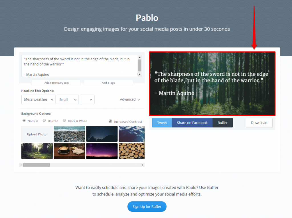
However, you can change the background image within the “Background Options” provided:
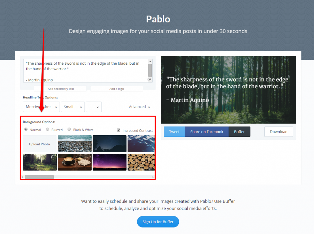
Pablo gives you two choices for background images. You can either upload your own photo from your computer:
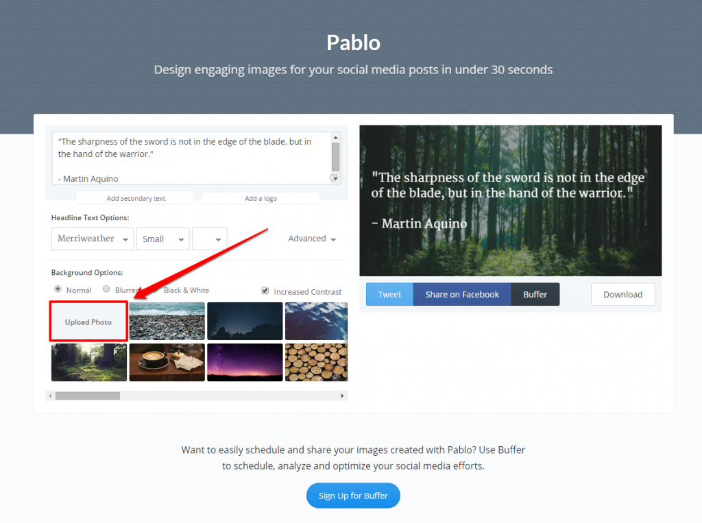
Or you can choose from the pre-loaded options provided:
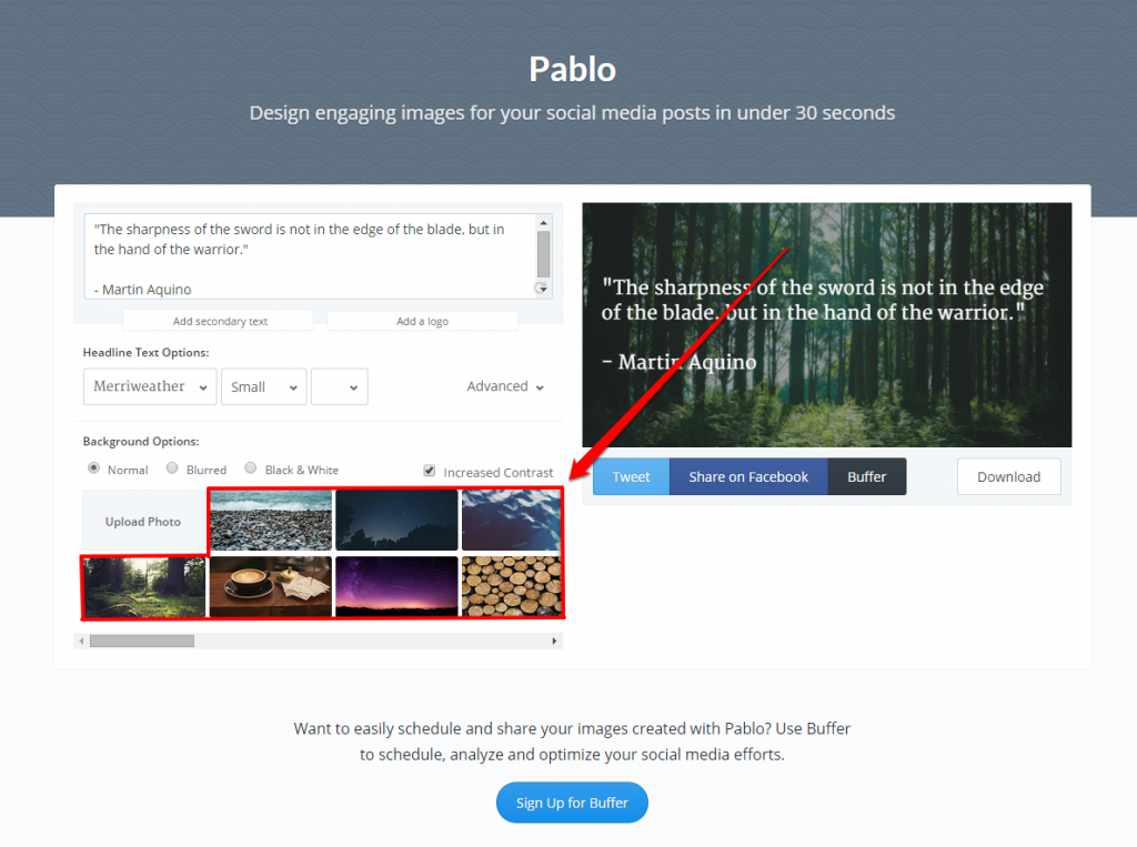
For this example (and because it’s a Tuesday!), I will use the coffee example provided by Pablo:
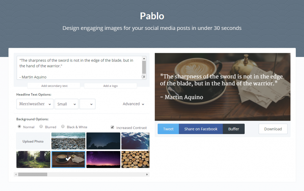
After selecting your background image, you then have a few different options to alter it further:
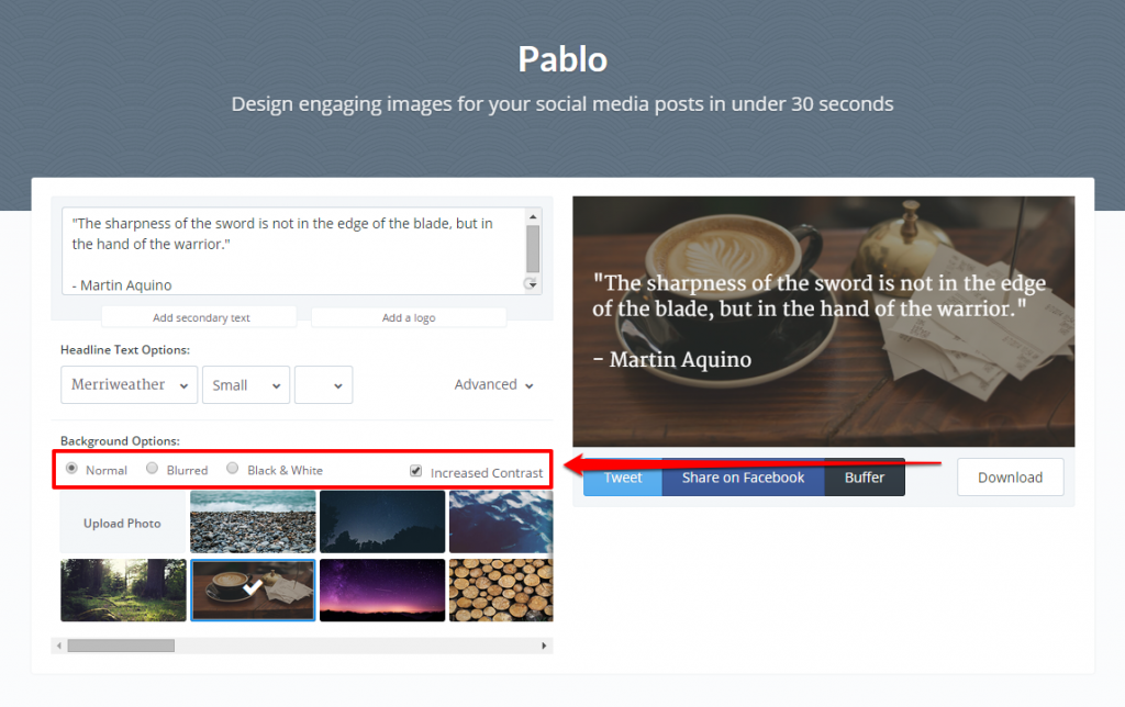
These options include “Normal”, which is selected by default.
Or “Blurred”:
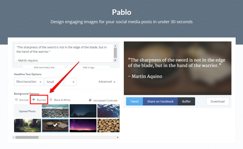
Or “Black & White”:
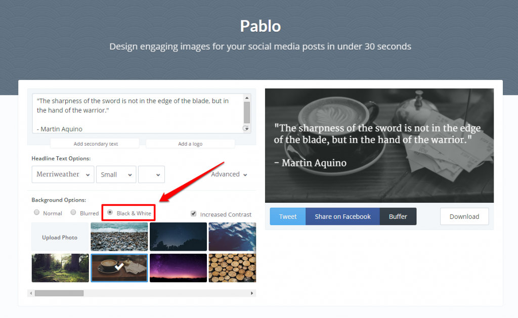
Let’s stick with “Normal” for this tutorial.
In addition to these three image options, you can also change the contrast of the picture:
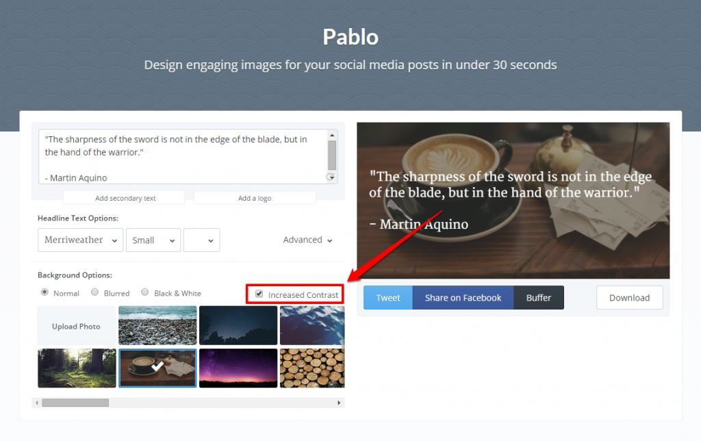
This option is selected by default, but here is what the image would look like without the increased contrast:
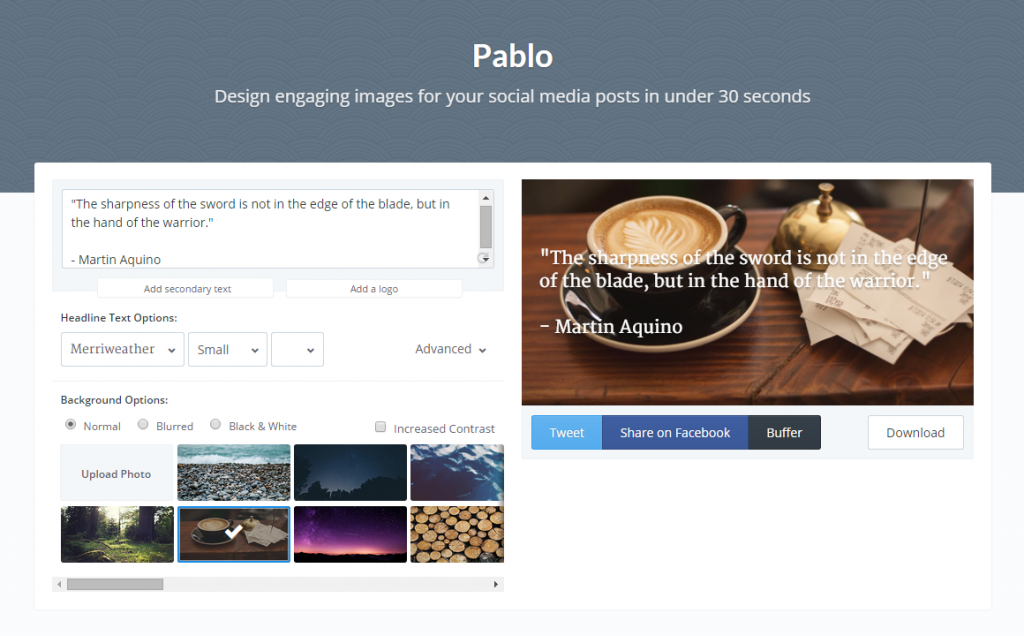
I’m going to leave the increased contrast option selected and move on to the text portion of my design.
Step Two: Add Text to a Pablo Image
The next step we will take in creating our image is to add our desired text. As you can see, Pablo comes pre-loaded with a default quote:
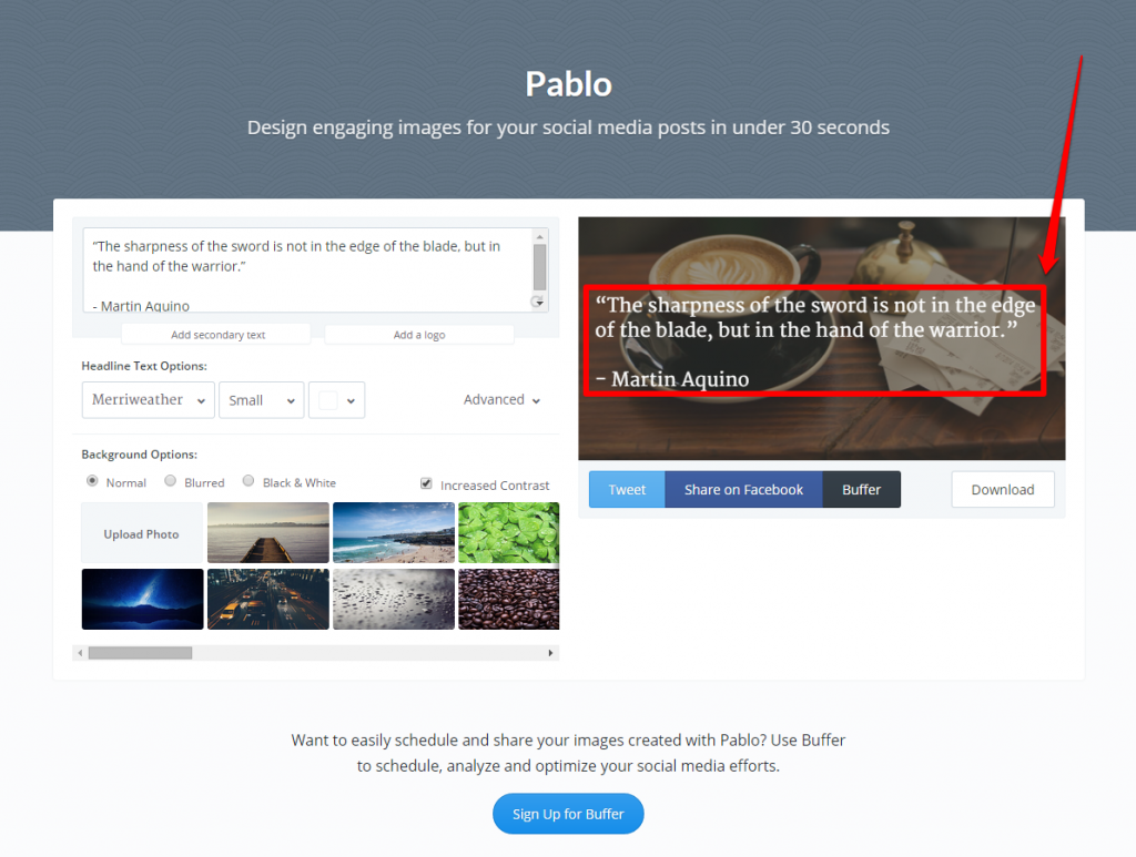
However, we can change this text within the provided text box:
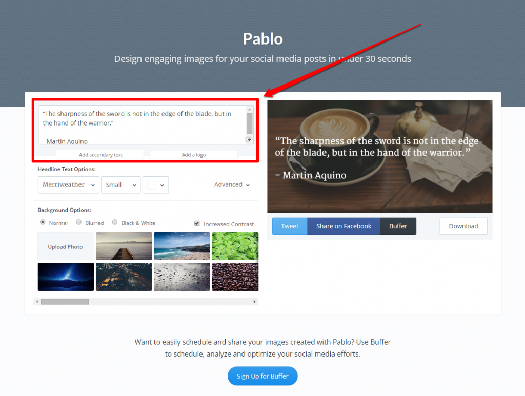
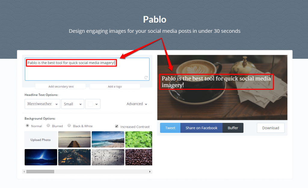
As we type in this box, the text will change on our sample image to the right. Once you have the appropriate text in the box, you can see a preview of what it looks like:
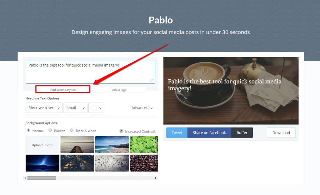
Along with the main text box, Pablo also gives you the option to add “Secondary text”:
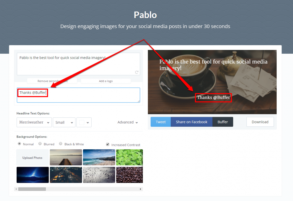
Clicking on the “Add secondary text” button will allow you to add a smaller headline to your image. For example:
You can also add a logo to your design, by clicking on the “Add a logo” button:
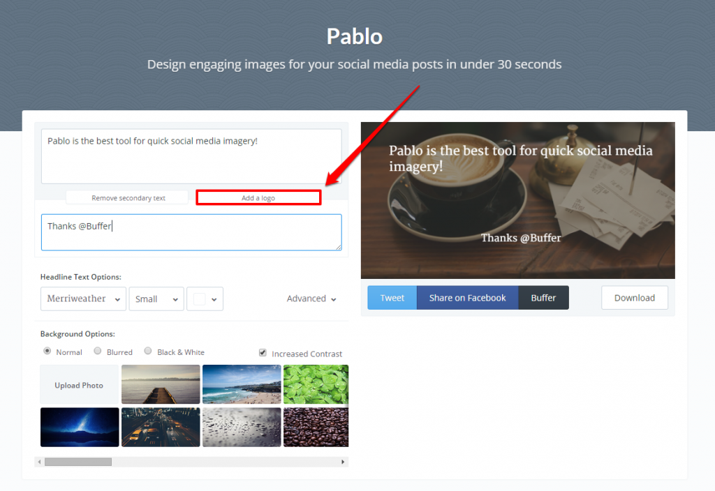
Clicking on the button will allow you to upload a logo/image from your computer. For example, I can upload the Linkarati logo:
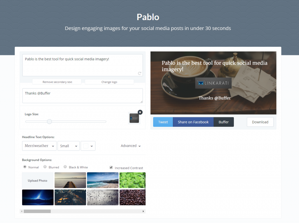
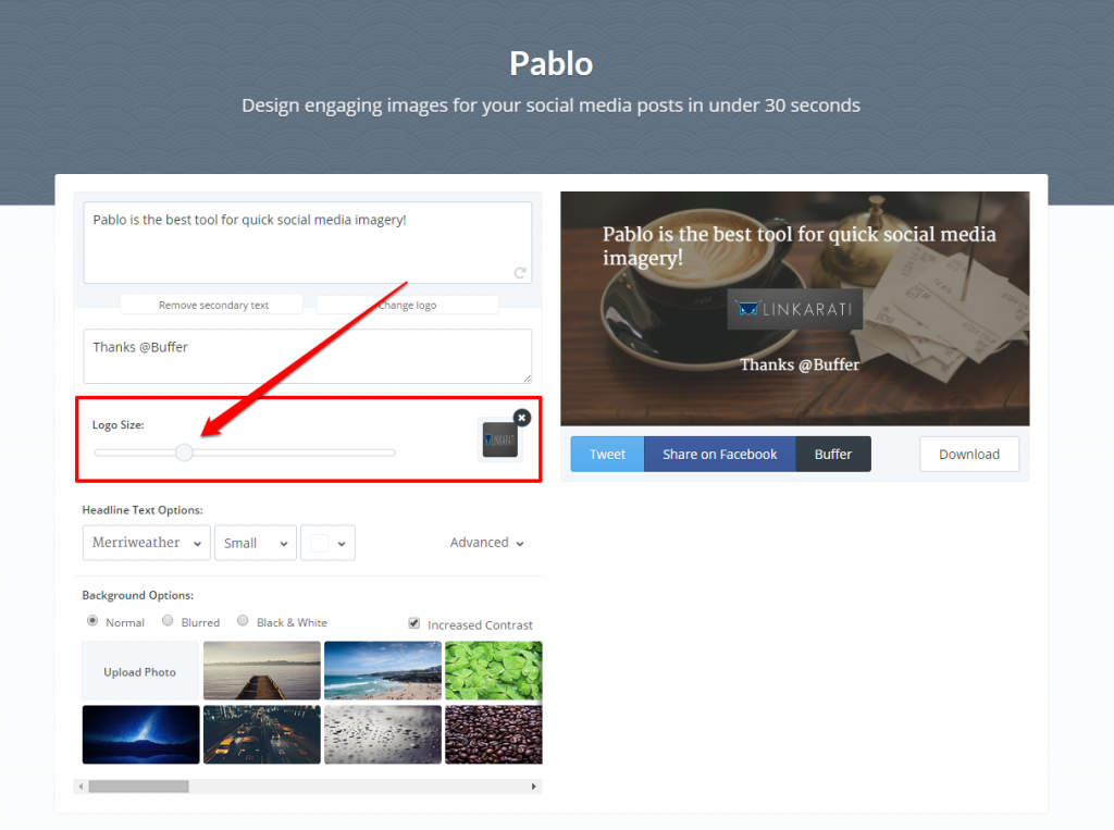
After you’ve added your logo, you can then adjust its size:
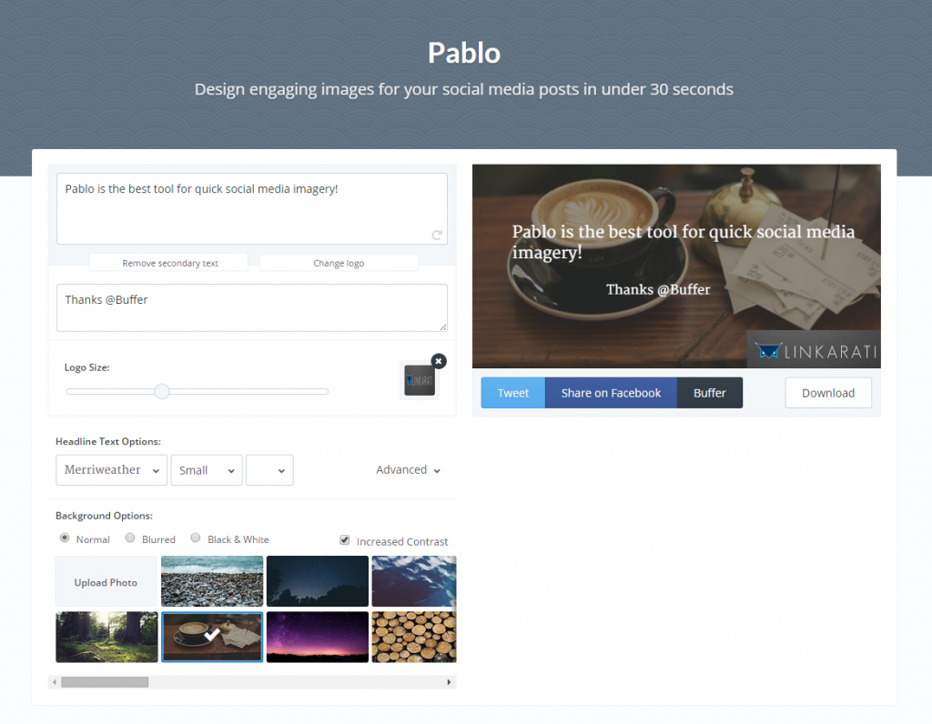
Once you have the desired size set for your logo, you can move it around on your design by simply clicking and dragging it with your mouse. You can also grab and drag the text boxes you have created.
Here is what my image looks like after shifting things around a bit:
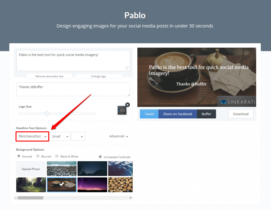
Now that you have your text in the appropriate spot, you can then change the font:
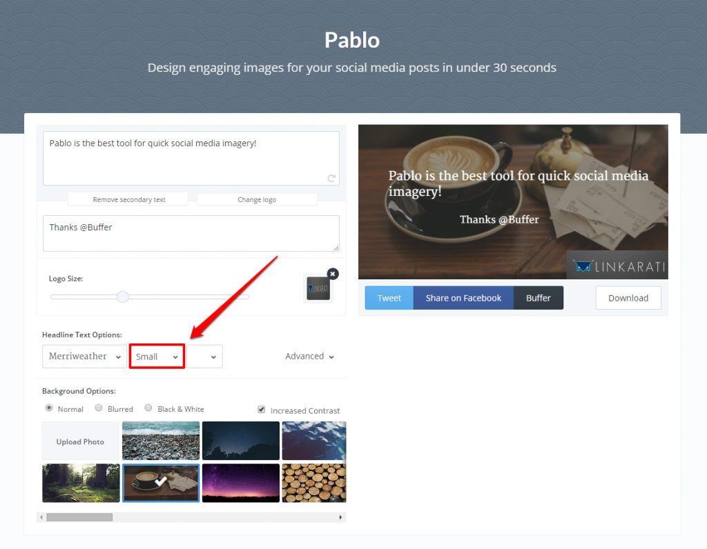
Size:
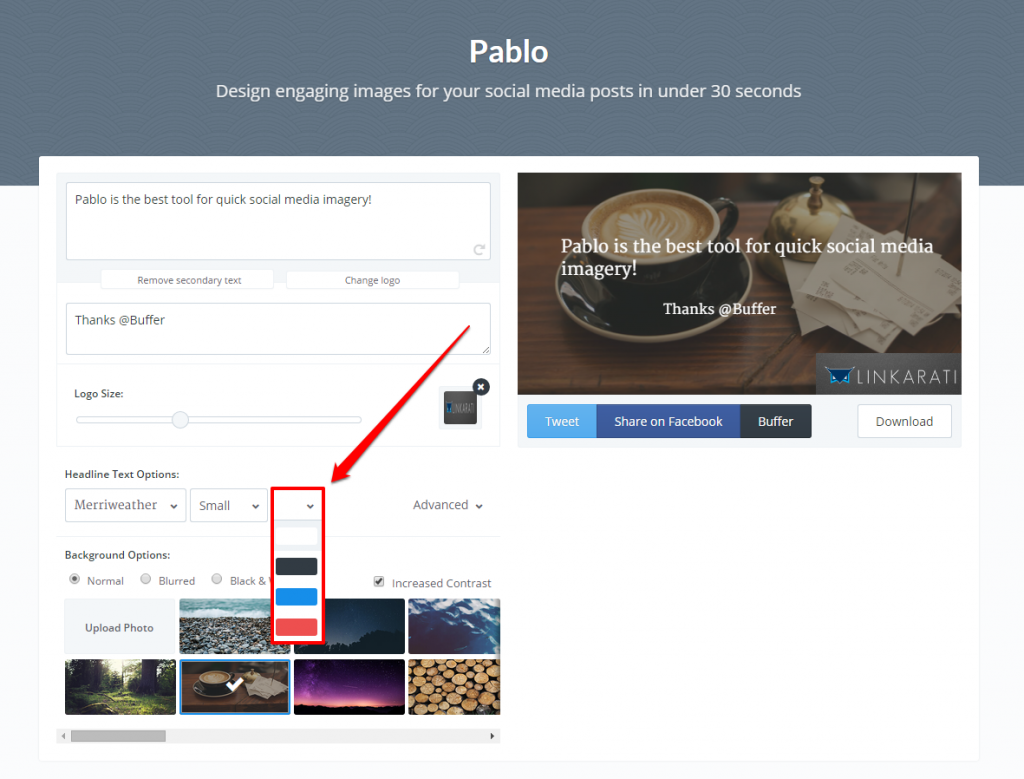
And color:
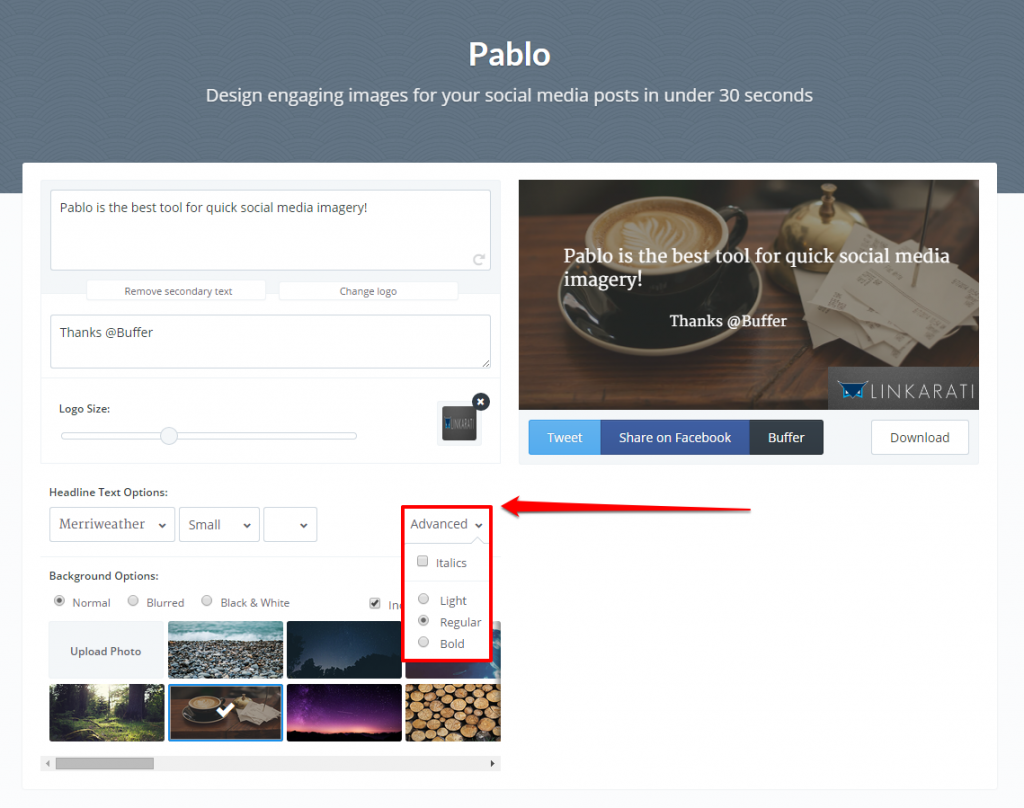
You can also click the “Advanced” button to select italics or bolding for your text:
After sorting out your text, you are ready to download or share your design!
Step Three: Download or Share Your Pablo Design
Now that you’ve created a design you’re happy with, you need to decide what to do with it.
With Pablo you have two options – download to your computer or share via social media (specifically, Twitter or Facebook).
You can find both of these options beneath the preview of your image:
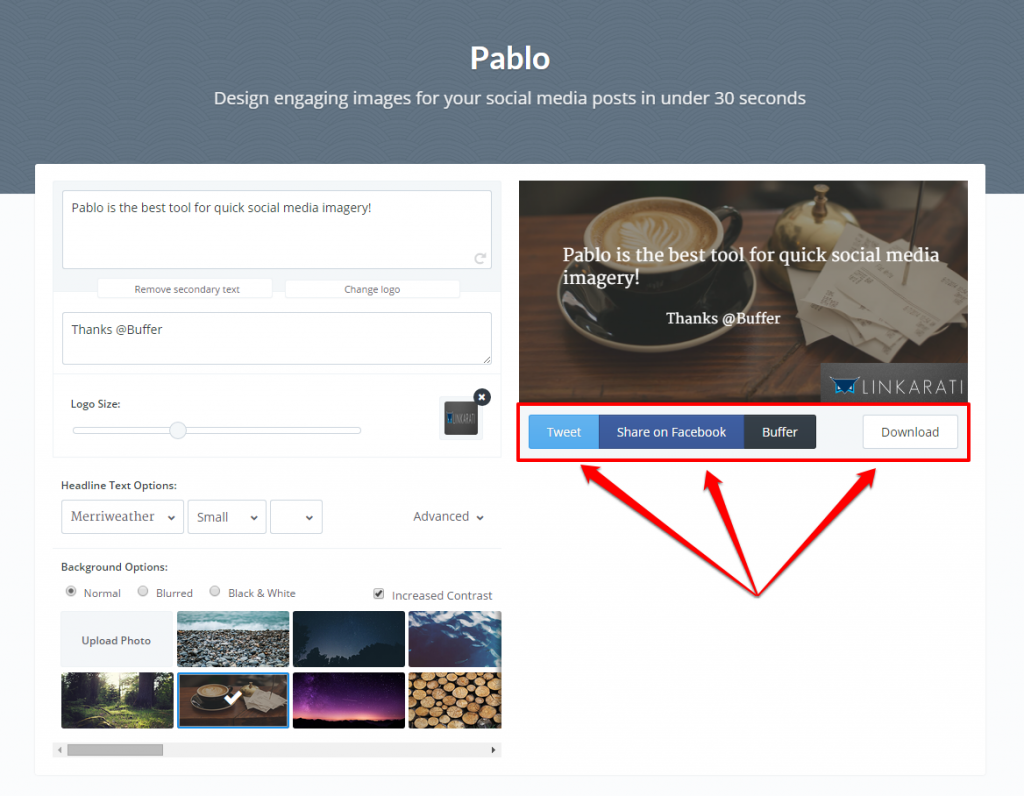
If you want to download the link to share later simply click the download link and save to your computer.
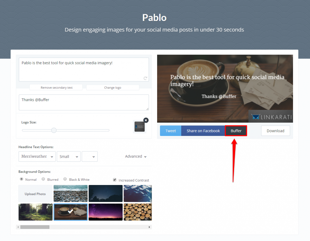
However, if you would like to share your post straight from the Pablo dashboard, you will need to first sign in to your corresponding social account. You can also use Buffer to schedule your social post for a later time (Note: You will need a Buffer account for this):
And now we have a simple, high-quality image perfect for social sharing!
To learn about some creative ways to use the designs you make with Pablo, check out this great post from Buffer.

